Fig. 1. Advanced Settings.

Advanced

This Theme Options tab allows to adjust advanced theme settings, add custom CSS and JS. Advanced Settings Here you can: set top & bottom margins for pages, posts & templates (see fig. 1); Fig. 1. Advanced settings. enable/disable responsive layout; specify side padding (for desktop and mobile layouts); turn on/off image lazy loading; enable smooth scroll;…
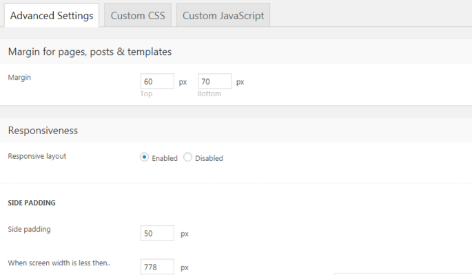
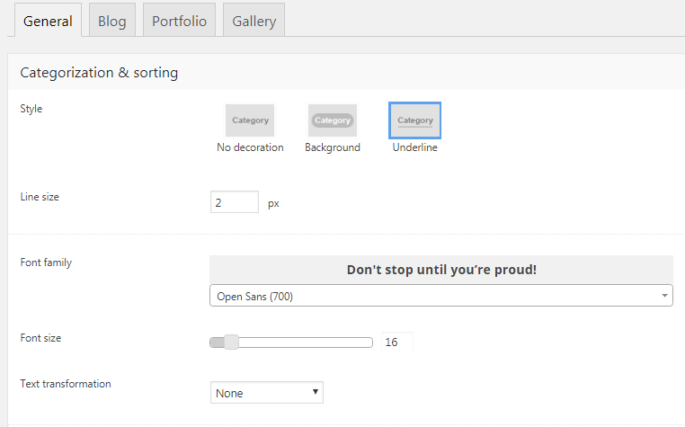
Fig. 1. Sidebar Settings.

Sidebar

Fig. 1. Sidebar settings. Here you can set: sidebar width; vertical distance between widgets; gap between content area and sidebar. After selecting sidebar style, you can also specify background color/image/decoration or dividers position (fig. 2). Fig. 2. Sidebar style and background. It is also possible to make the sidebar sticky (sidebar floats down upon page…

Fig. 1. Widget Area Management.

Widget Areas

You can create unlimited number of widget areas. By default, there are only two areas: default sidebar and footer. To add custom widget area, fill in its name and description (optional) fields in the right side of the page (fig. 1, section 1)  and hit the “Add” button. Your new widget will appear in the widget…

Fig. 1. General Settings For The7 Post Types.

Post Types

This section of Theme Options allows to manage appearance of Blog, Portfolio and Gallery posts, if “The7 Elements” plugin is enabled. General This tab allows to define style for pagination and category filters (see fig. 1): decoration, line size, font settings, padding and margins, as well gap below category filter and above pagination. Fig. 1. General…

Woocommerce Settings

WooCommerce (optional)

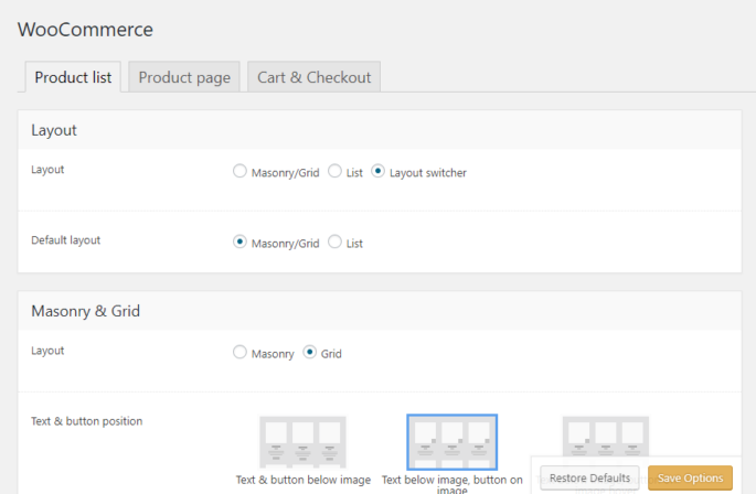
Note that page Theme Options > WooCommerce is optional and will appear only if you have WooCommerce plugin installed and activated. WooCommerce settings are divided into 3 tabs (fig. 1): Fig. 1. WooCommerce Settings. Product list Here you can: choose WooCommerce default layout: masonry or list, or masonry / list switcher ; decide where to show…

Fig. 1. Buttons Style.

Buttons

There are three predefined button styles (fig. 1): flat, 3D, shadow. Fig. 1. Buttons style. In this Theme Options tab, you can also specify: button idle and hover colors for background, text and border (fig. 2); Fig. 2. Button color settings. font family and font size, padding and border radius for 3 button sizes (small, medium and big).…

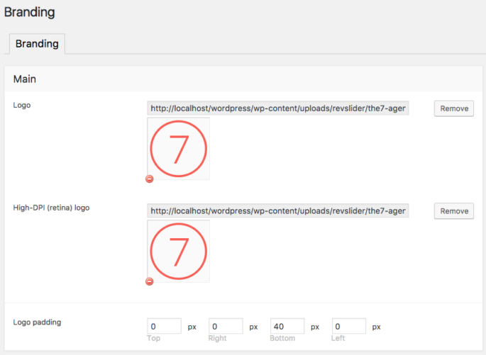
Fig. 1. Branding. Upload Logos.

Branding

On this page you can upload logos for different locations at your site, specify padding for these logos, set up copyright information, etc.: Note: Logos of different users comes in different size and ratio, so theme does not re size logos or do not prefer any specific size, you need to upload it in actual…

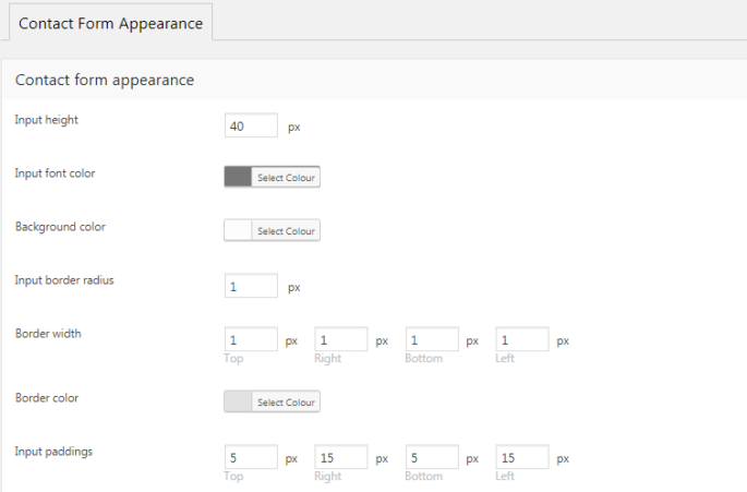
Fig. 1. Settings For Contact Form Appearance

Contact Form

This section of Theme Options allows to configure appearance of a contact form and pop-up messages for both contact forms and WooCommerce. Specify input fields size, colors, padding and border (fig. 1): Fig. 1. Settings for contact form appearance Then, you can choose whether to display contact form and WooCommerce messages inline or in a…

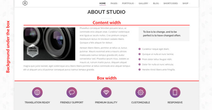
Fig. 1. General Layout Settings.

General Appearance

On this page various general setting are gathered. Here you can: set the content width in “px” or “%” (see fig. 1); select site layout: boxed or wide; set the box width in “px” or “%” if “boxed” layout is enabled (see fig. 1); set background color and image “under the box” (see fig. 1);…

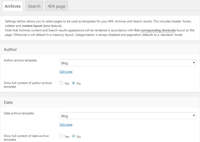
Fig. 1. Archive Settings.

Archives

This option allows to select page (fig. 1) layout for archives, search results, etc.For example, you have “My Sample” page with page title aligned to the right and sidebar on the left. If you select this page in Theme Options -> Archives and 404 -> Archives, it means that all archive pages will also have…