Create a Grid
In this guide, we will show you the main steps to create a fully functional grid. Grid settings provide further options and possibilities which are not presented in this guide. However, all grid settings have descriptions in the admin interface and are self explanatory.
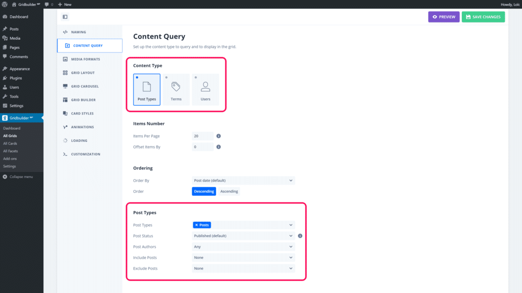
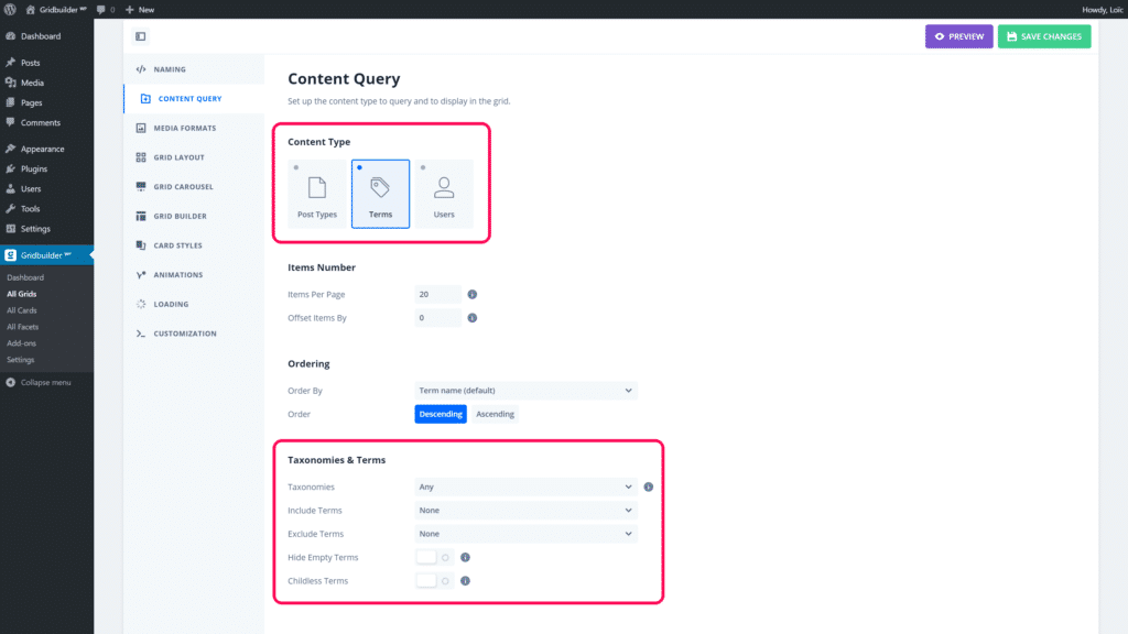
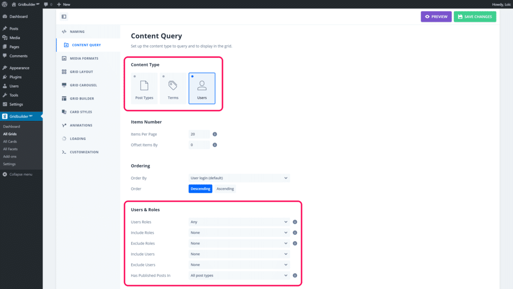
To get started, you need to set which content from WordPress you want to query and display in your grid. You will find, in Grid Settings > Content Query, 3 types of content:
- Post types (posts, pages, media or custom post type)
- Terms (categories, tags or custom taxonomy terms)
- Users (WordPress users)
Depending of the selected source, you will find settings to adjust the content displayed in your grid. For example, if you use post type, as source type, you will be able to query posts by taxonomy term(s). Each source has its own settings to fine tune content queried and displayed in the grid.
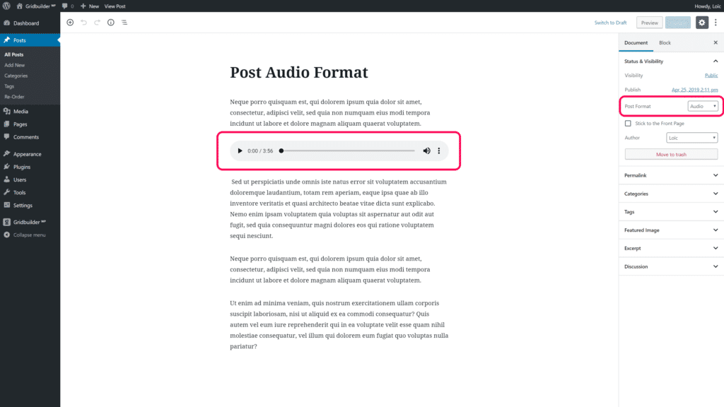
Gridbuilder ᵂᴾ works with WordPress post formats to handle media in each card (post, term or user).
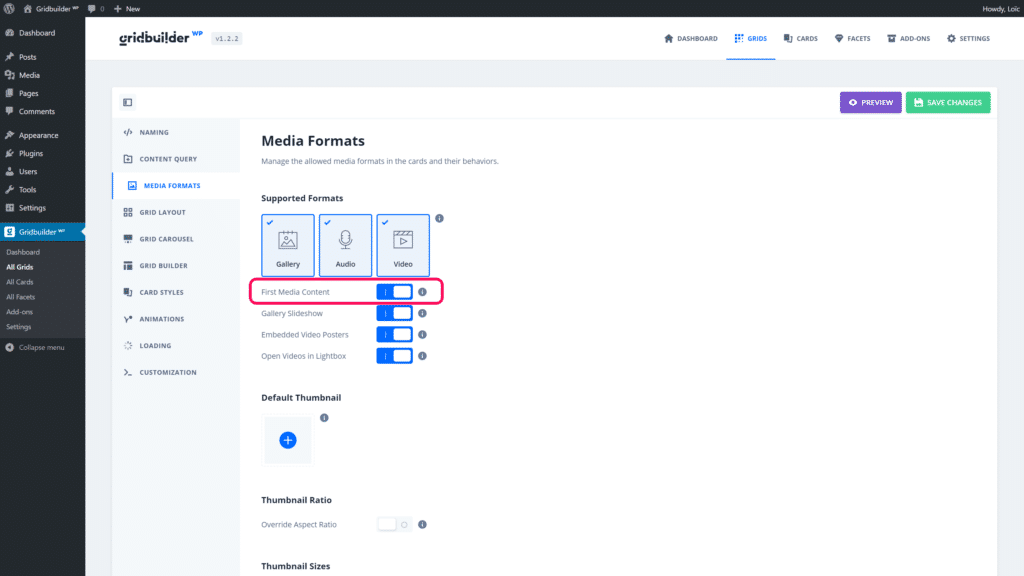
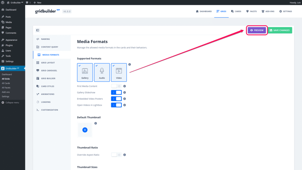
In Grid Settings > Media Formats, you will be able to set which media formats are allowed in your cards. It means that you can allow or not gallery, audio or video formats.
Gridbuilder ᵂᴾ can automatically fetch the first media in the post content according to the post format. If you want a such behaviour, you need to enable the option First Media Content
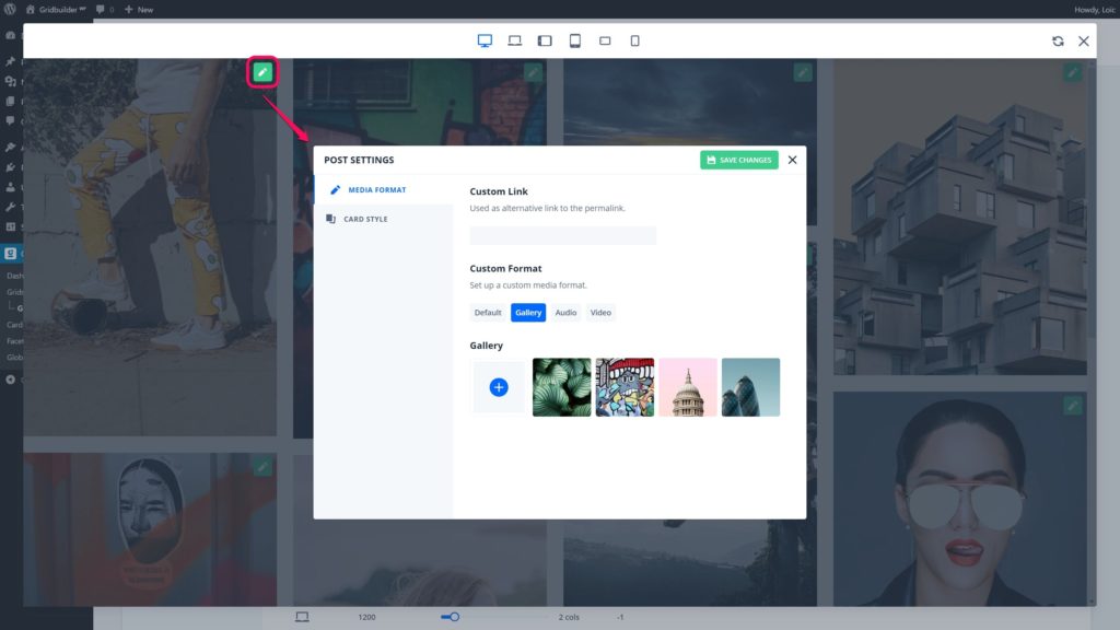
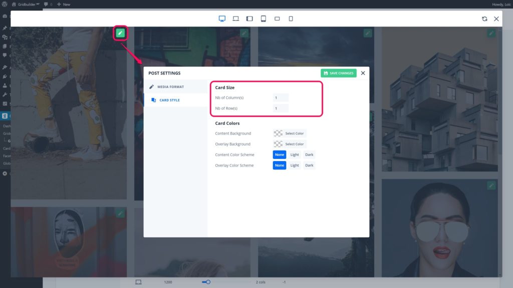
Otherwise, you can set media format and media content inpreview mode in your grid settings. In preview mode, each grid item has a settings button to edit the post, user or term.
When you set up a media format in preview mode this applies to the post/user/term. So, these settings will be used in all grids because it’s attached to a post/user/term custom field.
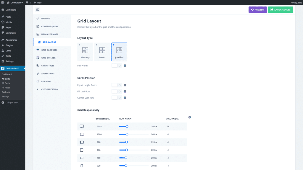
Once you have set content to display in your grid, you need to set the type of layout of your grid. There are 3 types of layout:
- Masonry: This layout applies a number of columns to each item and keep natural heights according to image aspect ratio and content length.
- Metro: This layout applies a number of columns and rows to each item. So, in most of cases it will crop images and it cuts content which overflows.
- Justified: This layout applies an average row height to each item and keep natural width of images. It preserves image aspect ratio but it cuts content which overflows.
Each type of layout has its own settings like the number of columns, the row height, etc.
In preview mode, you will be able to set the number of columns and rows of each post/user/term. These settings will be used in all grids because it’s attached to a post/user/term custom field.
In Grid Settings > Card styles you will be able to assign card(s) to your grid. If you use as source type Post Type, you will be able to assign cards per post type and per post format.
A card corresponds to a Grid Style (Masonry, Justified or Metro). Masonry cards can only be used with a Masonry grid style. This restriction is due to the fact that Justified and Metro styles constrain cards in height. So, it’s not possible to have content above or under the thumbnail like with a Masonry card. Otherwise content will overflow.
However, Justified and Metro cards can be used with any kind of grid style.
That’s it, you’ve just created and set up a grid. Now, your grid needs to be inserted in your page thanks to shortcode or Gutenberg block
