“Photo Albums” allow to gather images and videos. Read on how to fill-in “video URL” field here – fig. 2.
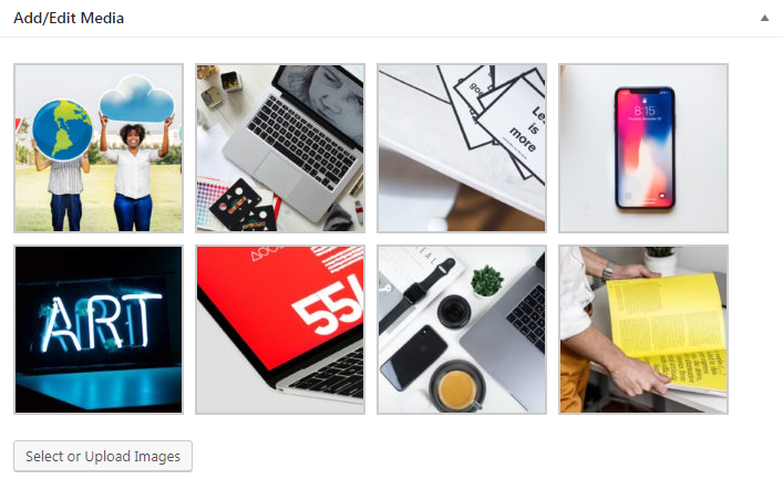
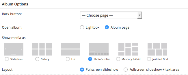
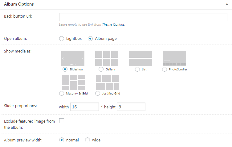
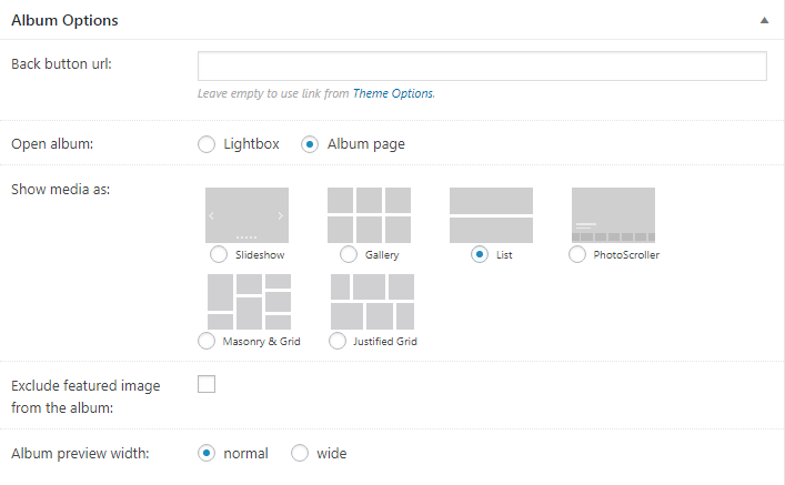
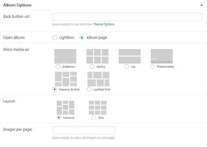
To create an album, navigate to “WP-admin > Photo Albums > Add new Album”. Album editing interface is similar to Portfolio Project. Apart from, header options and widgetized areas, Albums adding/editing interface has 2 auxiliary boxes called “Add/Edit Media” (fig. 1) and “Album Options” (fig. 2).
Add/Edit Media box is 100% identical to “Add/Edit slides” box in slideshows (please refer to this article for details).
Album Options. Here you can:
- select an album page for the “Back button” (more info is available here);
- choose how your album will be opened from albums list: in a lightbox or on a separate album page;
- select a layout for displaying images: slideshow, gallery, list, photo scroller, masonry or grid;
- decide if you want to exclude featured image from the album (i.e. use that photo only as an album cover);
- decide if you want to display text content.
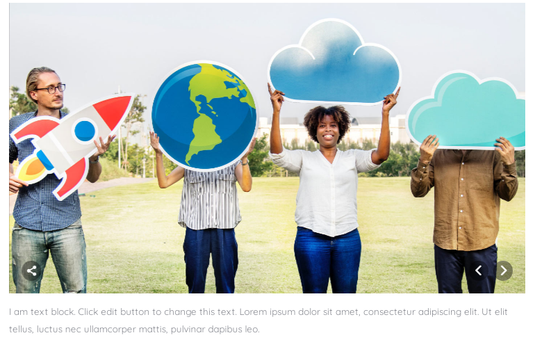
Depending on a chosen layout, you get a set of options for configuring this layout. For example, Slideshow (fig. 3) or Gallery (fig. 4).
Slideshow
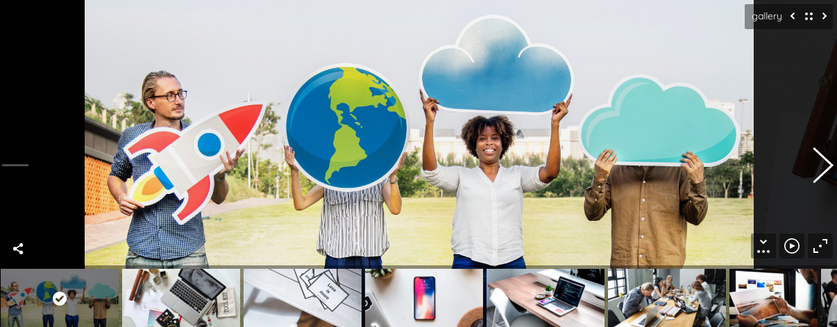
The only specific option in this case (fig. 3) is slider proportions.
Gallery
“Show media as: Gallery” allows you to display the media in form of fancy metro-style gallery. You can choose desired number of columns and make first image x2 large.
List
Show media as: List (fig. 5). Choosing this option will display your images as boring list of images; there’s even no additional option here ?
Photo Scroller
Show media as: Photo Scroller. Basically this is the same Photo Scroller as you see in the “Page Header Options > Photo Scroller“. You have same set of options here:
- layout: fullscreen slideshow (will hide text area) or fullscreen slideshow + text area;
- background behind the slider;
- show/hide pixel overlay.
- padding;
- inactive slides opacity;
- thumbnail stripe. You can hide/show it by default or disable it altogether;
- thumbnails width and height;
- specify slider default state: playing or paused;
- autoplay speed (interval);
- 2 blocks of settings for landscape and portrait images: min and max width, filling mode (fit or fill) for desktops and mobile devices.
Masonry & Grid
Basically, this is the same layout as you see in the “Blog Masonry & Grid” element. You have almost the same set of options here:
- choose Masonry or Grid layout;
- specify how many images to display per page;
- specify the gap between images and column minimum width;
- set desired columns number;
- make this gallery 100% browser wide;
- decide whether to resize images or not;
- select loading animation effect.
Justified Grid
This layout looks like “Portfolio Justified Grid” element. The only specific settings it has are:
- gap between images;
- row target height;
- make this gallery 100% browser wide;
- hide last row if there’s not enough images to fill it;
- decide whether to resize images or not;
- select loading animation effect.
