Docs » General » How to hide a row on specific device?
At times, you find some designs are not suiting well on few devices; e.g. mobile; or you may need a totally different design of a particular section when it’s viewed on smaller screens.
This can be achieved by creating totally different rows and designing elements in them differently – targeting particular screen sizes. Then – you can display only particular rows on only particular device with using any of the two ways explained as below –
- Apply CSS class to the rows + write some CSS with media queries that will display particular rows on only particular devices.
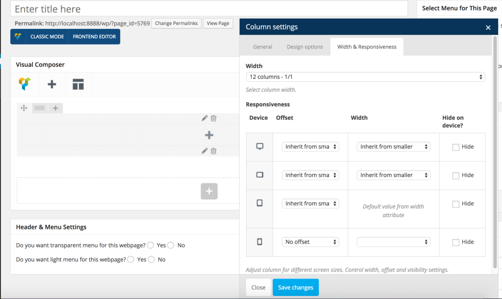
- Edit column & use Visual Composers “Width & Responsiveness” settings to hide particular columns on particular devices.


