#comment>
We have provide best possible CSS options that are possible for background images.
Let us explain how do they work –
-
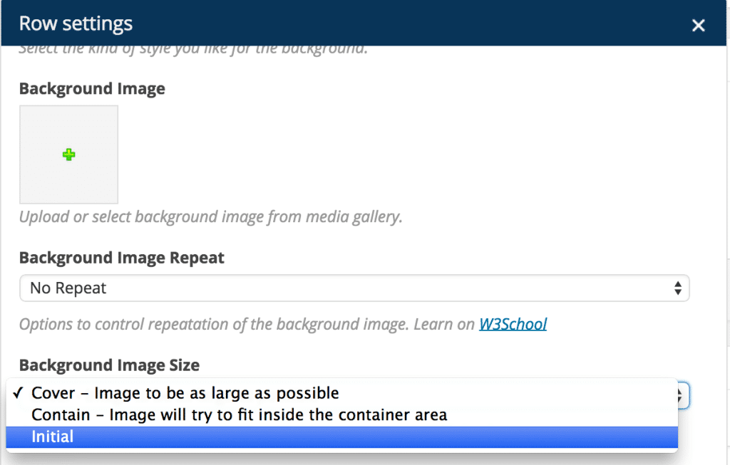
Contain –
100% Images will always be in the row, doesn’t matter what’s the width of your screen / which device you are on. (The preference is to show 100% image – the remaining area of row may have white space)
-
Cover –
Image will cover 100% area of the row and the rest portion will not be displayed.(Will cover the width & height – both; of the row. This means – some portion of the image can go off)
-
Initial –
Image will be displayed as it is. It won’t size itself depending on width of the screen.
Contain & Cover as explained above are responsive background images. You will need to choose depending on your preference – whether to show full image and let row have white space OR to cover complete area of the row and it’s okay if image goes off as it needs to.
Finally – If you ask for our advise –
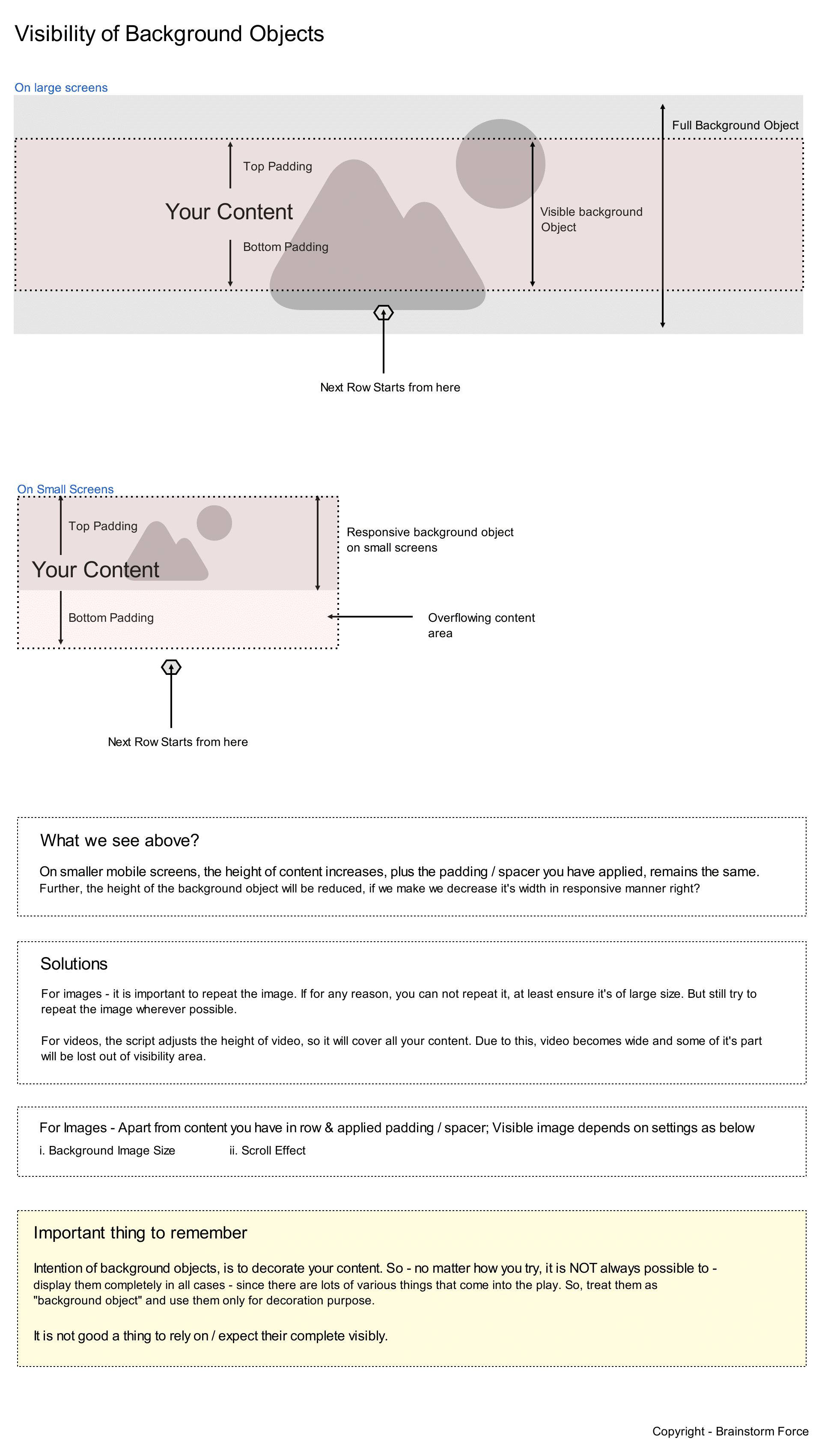
User should go with Cover background type whenever possible as it always covers the complete row area on all screens sizes. Since you are implementing the background image, the preference should be given to content & not to the background. The background image is intended for usage in decorating the sections – not to display important information in them that must be visible.
If you choose “Contain” – the image wouldn’t be on complete content (elements) section that’s inside the row. And it’s important to remember that height of the row increases on smaller screens.
In either case, ALWAYS keep “Background Image Repeat” option to “Repeat” – as it will act as fallback & cover the row area & background image will be behind content / elements. If your background image can not be repeated for some reason, make sure that image is as large as possible (ex – 2220px X 1380px +)
All the best!


